
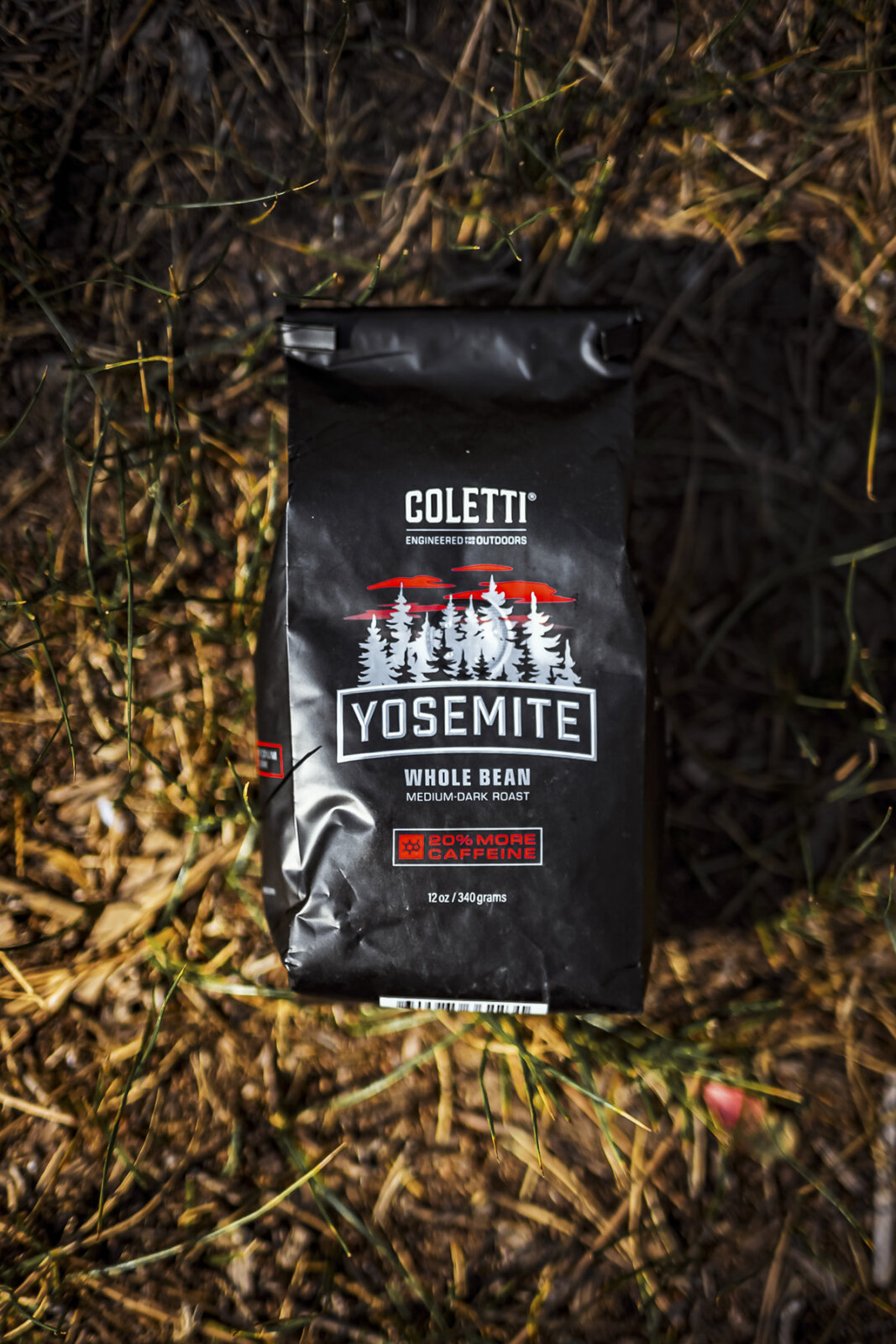
Most product catalogs stop at exactly one shot, a clean white background with the item floating dead center like a hostage in a ransom note, and somehow that gets called the whole sales pitch. I did this for years. One photo, evenly lit, technically correct, and about as persuasive as a parking ticket.
A single white-background image is not wrong, exactly. Amazon and most marketplaces require one as the primary listing photo. It is the fastest way for a shopper to compare fifteen tabs at once without reading anything. The mistake is stopping there and calling it “complete product photography.” That phrase gets used the way “empowering” gets used in a boudoir ad, constantly, without anyone bothering to check if it means anything.
One Angle Answers Nothing
A product photo has to replace the parts of a physical shopping trip a screen cannot fake. Picking the thing up. Turning it over. Holding it next to something you actually own for scale. A single hero shot skips all three and just expects the buyer to trust the gap.
Real comparative research backs this up, and I wish it did not. It means the lazy version was never going to work. Nightjar pulled data across multiple independent studies on product imagery. Pairing a white-background hero shot with real lifestyle images lifts conversion by roughly 30 percent over the hero shot alone.
The same research ties fuller photography to lower returns too. A buyer who can actually see scale and material before ordering trusts the purchase more. They don’t ship the thing back three days later claiming it “looked different online.” It did not look different online. The photo just lied by omission. Five to eight images per product keeps showing up as the real sweet spot. That’s enough to answer the questions a buyer actually has. It’s not so many that half of them are the same angle wearing a different hat.
The Shots Actually Worth Planning
A useful gallery is not one good photo cloned four times. It is a small set of genuinely different shots, each one earning its spot by answering something the others cannot.
The hero shot still matters. Clean background, accurate color, sharp focus, doing the least persuading and the most literal representing. A detail and texture shot is a close crop on stitching, grain, or hardware. It quietly answers “does this look cheap in person” before the buyer has to type it into a review. A scale reference (a hand, a coin, a person actually wearing the thing) does more work than a dimensions line in the description. Nobody trusts a tape measure they cannot see.
An in-use shot sells the outcome instead of the object. A lamp lighting an actual room at 9pm does more than a lamp glowing alone in a lightbox, waiting for someone to visit. A flat lay or styled grouping earns its place when a brand sells a line instead of one item. It shows how the pieces sit together without making the buyer imagine it.
That’s the list. Five shot types, not fifteen, because a bloated gallery is just a confident way of hiding the fact that nobody planned it.
Where “Looks Cheap” Actually Comes From
Nobody emails a brand to say the lighting was uneven. They just leave. The product gets filed under “looked cheap” in their head. That’s really a filing error for “showed me nothing.” Harsh light that wrecks the color. A background fighting the product for attention. One flat angle hiding every bit of texture. None of that is a style problem. It is an information problem wearing a style problem’s clothes.
Fixing it does not mean making the product look fancier than it is. It means showing what is actually there, clearly enough that the buyer stops guessing and starts deciding.
For a catalog with real volume, the temptation is to standardize on whatever is fastest and stop. That is usually the white background alone, because consistency is cheap and thinking is not. The data above is the argument against that shortcut. Lifestyle and detail shots are what actually move the two numbers that hurt a catalog: lost conversions, and returns that never needed to happen.
If you are planning a shoot for a real product line, build the shot list around what a buyer actually needs to see. Not a generic checklist copied from a blog post exactly like this one. That is the conversation worth having before the first frame gets shot. Tell me what you are selling. I will tell you which of these five actually earn a place in your catalog, and which one you can skip without losing a sale.