Pick up your phone and search for something you’d normally buy in a store. A leather wallet. A wool sweater. A handmade ceramic mug. Find a listing with photos and ask yourself one question: can you tell what this product would feel like in your hands?
For most listings, the answer is no. You can see the color. You can see the shape. You might be able to tell it’s leather or wool or ceramic from the description. But the photos give you no sensory information about the product’s texture, weight, or material quality. They show you what it looks like from across the room. They don’t show you what it feels like when you pick it up.
That missing information is the single biggest obstacle between your product and a purchase decision. Research consistently shows that roughly 46% of online shoppers identify not being able to physically touch a product as the number one disadvantage of shopping online. And about 22% of e-commerce returns happen because the product looked different in person than it did on screen. Not the wrong size, not the wrong color. Different. The physical reality of the product didn’t match the expectation the photos created, or more accurately, the expectation the photos failed to create.
This is the gap that texture photography closes. And almost nobody in e-commerce is doing it deliberately.
Your Product Photos Are Answering the Wrong Question
Most product photography answers the question “what does this look like?” A clean white background, even lighting, the product centered in frame. For marketplace compliance (Amazon, Etsy, Walmart), this is the baseline requirement. It gets you listed. It does not get you sold.
The question your customer is actually asking is closer to “what would it feel like to own this?” They want to imagine holding it, wearing it, using it in their kitchen or their office or their living room. When a customer is shopping in a physical store, they pick the product up. They run their thumb across the leather. They feel the weight of the ceramic. They rub the fabric between two fingers. That physical evaluation is one of the primary ways humans assess quality, and online shopping eliminates it entirely.
Your photography has to compensate for that absence. And a clean product shot on white doesn’t compensate for anything. It confirms shape and color. That’s it.
Consumer psychology research has established a measurable trait called “Need for Touch,” describing how different consumers rely on physical contact to evaluate products. Some people need to touch things before they buy them, and those consumers are significantly harder to convert online. But here’s what matters for your photography: even for consumers who don’t have a high need for physical touch, visual depictions of texture trigger what researchers call “mental simulation.” When a shopper sees a close-up of leather grain with visible pores and natural variation, their brain generates an imagined tactile experience. They can almost feel it. That mental simulation increases perceived quality, builds purchase confidence, and reduces the likelihood of a return.
The research is specific. Products with visible tactile qualities produce mental simulation regardless of the device the customer is using. That mental simulation drives favorable product attitudes. Simply imagining touching a product increases purchase intention through a mechanism of psychological ownership: I can picture holding it, so it already feels like mine.
(This also explains why lifestyle photos, where someone is actually using or handling the product, consistently outperform static product shots on direct-to-consumer sites. They’re not just showing context. They’re modeling the physical interaction that the customer can’t have.)
What Texture Photography Actually Looks Like in Practice
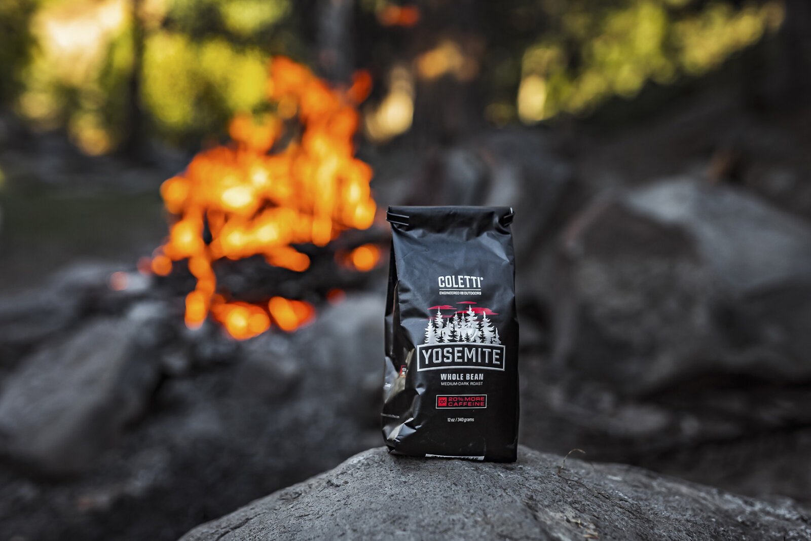
Texture photography is not a separate category of photography. It’s a specific type of close-up shot that reveals material characteristics a standard product photo doesn’t capture. The leather grain on a bag. The ribbed knit of a sweater. The matte finish versus gloss on a phone case. The bubbles in handmade soap. The wood grain on a cutting board. The flaky, golden crust on a pastry.
These shots require specific technique because texture is primarily communicated through light and shadow at very small scales. A flat-lit product photo eliminates the shadows that make texture visible. That’s why product photos taken with a ring light or diffused studio lighting can make a hand-thrown ceramic mug look like injection-molded plastic. The light is so even that it erases the surface variation that communicates “handmade” and “high quality.”
For texture to read correctly in a photograph, the light needs to skim across the surface at a relatively low angle. This creates micro-shadows in every pore, stitch, grain line, and surface imperfection, and those micro-shadows are what the viewer’s brain interprets as texture. Side lighting or raking light is the standard approach for texture photography, and it’s the opposite of what most standard product photography setups use.
The other technical requirement is resolution. Texture detail only communicates quality if the viewer can see it at close range. This means the original photograph needs to be shot at high resolution with a lens capable of rendering fine detail, and the e-commerce platform needs to support zoom functionality at sufficient resolution. Industry research found that enabling zoom increases conversions by 15 to 30%, and the value of zoom is directly proportional to how much detail the zoomed image reveals. If a customer zooms in on your leather wallet and sees blurry pixels instead of leather grain, the zoom feature is working against you.
The Five Product Photos That Actually Drive Sales
The data on how many images a product listing needs is clear. A study analyzing 2.3 million product listings found that products with five or more images see 50% higher conversion rates than single-image alternatives. Amazon recommends six to nine images. Etsy sellers report measurable traffic drops when reducing from ten images to six.
But the number of images matters less than what those images show. The most common mistake in product photography is filling all available image slots with minor variations of the same front-facing shot. Research confirms that redundant angles provide zero conversion lift. Each image needs to answer a different question.
Based on the conversion research, here are the five image types that matter most and why each one drives a specific purchasing decision.
The hero shot is the image that appears in search results. On marketplaces like Amazon, this must be a white-background product shot that complies with platform requirements. On your own site, a lifestyle shot often outperforms white background for the hero position. A/B test data shows platform context matters significantly: the same product photographed in the same two styles converted better on white background on Amazon and better in lifestyle context on Shopify. Don’t assume one approach works everywhere.
The texture and detail close-up is the image this entire article is built around. It shows the material quality that the customer would evaluate by touch in a physical store. Leather grain, fabric weave, surface finish, stitching quality, hardware detail. This shot compensates for the touch barrier more directly than any other image type. It also reduces returns by setting accurate material expectations. If your product’s value depends even partially on the quality of its materials, this image is not optional.
The scale reference addresses the fact that customers cannot gauge physical size from a product photo alone. Industry research found 42% of users attempt to judge product size from images, and 28% of e-commerce sites fail to provide in-scale images. A product shown next to a human hand, on a table, or alongside a common object gives the customer the spatial information they need to make a confident purchase.
The lifestyle or context shot triggers mental simulation of ownership. It shows the product being used, worn, or placed in an environment the customer can relate to. This image type converts 22 to 30% better than standard packshots on DTC sites. The mechanism is straightforward: seeing someone hold your product helps the viewer imagine holding it themselves, which triggers the psychological ownership effect that drives purchase intent.
The informational image covers whatever the customer still needs to know: what’s included in the box, comparative sizing, feature callouts, or care instructions. On Amazon, infographic-style images with text overlays showing key specifications perform well in positions two and three. On DTC sites, this can be simpler since you have full product description real estate alongside the images.
That’s five images, each answering a different question. You can add more if your product has additional features worth showing, but these five cover the core decision-making sequence: does it look good, does it feel good, how big is it, what does it look like in real life, and what else do I need to know.
Why Beautiful Photos Still Fail
The most expensive mistake in product photography is producing images that are technically excellent but strategically empty. Perfect lighting, perfect composition, beautiful color. And a conversion rate that matches the competitor who shot with an iPhone on a kitchen counter.
This happens because the photography was planned around the image rather than around the sale. The photographer composed for visual impact instead of for decision support. The resulting photos look great in a portfolio or on Instagram. They don’t answer the questions customers are actually asking.
Airbnb’s published research on listing photography illustrates this directly. They found that what the photos show matters more than how they look technically. Living room images increased bookings by 35%. Bedroom-focused images actually decreased bookings. The aesthetic quality of the photos was secondary to whether they showed the specific information the buyer needed.
The same principle applies to product photography. A beautifully styled flat-lay of your product might earn likes on social media. But if it doesn’t show the material quality, the actual size, the product in use, or the details that distinguish it from competitors, it’s not doing the work your product listing needs it to do.
I see this pattern regularly with businesses that invest in photography without a strategic brief. They hire a good photographer, get beautiful images, upload them, and nothing changes. The problem was never the photography quality. The problem was that nobody asked “what does the customer need to see in order to feel confident making this purchase” before the shoot.
That question is the difference between product photography as a creative exercise and product photography as a conversion tool.
The Shot List Your Photographer Needs
If you’re selling a physical product online, your photography brief should be built around the buyer’s decision process, not around what looks good. Here’s how to translate the research into a shot list you can hand to a photographer.
Start by listing every question a customer might have that a photo could answer. For a leather bag, that might include: what does the leather quality look like up close, how big is it relative to a person, what does it look like when it’s full versus empty, what’s the hardware like, how does the strap sit on a shoulder, what pockets and compartments does it have, what colors is it available in.
Each question becomes a shot on the list. The texture close-up answers “what does the leather feel like.” The scale shot answers “how big is it.” The lifestyle shot answers “what does it look like on me.” The detail shot of hardware answers “does this look cheap or well-made.” The interior shot answers “will my stuff fit.”
The most critical instruction for your photographer is about the texture and detail shots specifically. These require different lighting than the standard product shots. If your photographer lights the whole shoot with the same soft, even illumination, the texture shots will be flat and uninformative. Communicate that you need close-up shots lit specifically to reveal surface detail, with directional light that creates the micro-shadows that make texture visible. Any experienced product photographer will know what this means. If they don’t, that’s useful information about their experience level.
For material-specific guidance: leather and wood products need raking light to show grain. Fabric and knitwear need enough contrast to show weave and texture without harsh shadows that distort color. Metal and glass need controlled highlights that show finish quality (brushed, polished, matte) without blowing out reflections. Food needs diffused directional light that shows surface texture (crust, glaze, bubbles, moisture) while keeping colors appetizing. Ceramic and pottery need light that reveals the surface characteristics that distinguish handmade from mass-produced.
(None of this is exotic technique. It’s standard product photography, executed with the specific goal of showing what the product feels like rather than just what it looks like. The difference is in the intent of the brief, not in the technical difficulty of the shoot.)
Pair Texture Photos with Descriptive Copy
Research on sensory marketing produced one finding that surprised me. In studies comparing visual haptic information (photos showing texture) against verbal haptic information (descriptive copy about how a product feels), the verbal descriptions often outperformed the photos in generating mental simulation. Telling someone a shirt is “brushed cotton with a broken-in softness” triggered more sensory imagination than showing a close-up of the fabric alone.
The implication is that texture photography works best as a confirmation of what the copy describes, not as a standalone sensory cue. When a customer reads that a leather wallet is “vegetable-tanned with a buttery grain that develops a rich patina over months of use” and then sees a close-up that confirms exactly that description, the combined effect is stronger than either element alone.
This means your product listings need both. The texture photo shows the material quality. The copy describes the tactile experience. The customer’s brain does the rest, combining visual and verbal information into a simulated physical evaluation that builds the confidence to purchase.
Most product listings have one or the other. They have detailed technical copy paired with flat, uninformative photography. Or they have gorgeous photography paired with copy that says “genuine leather” and nothing else. The integration of both, planned together, is where the conversion advantage lives.
How to Know If Your Product Photography Is Working
The simplest test is your return rate. If customers are returning products because they “looked different in person” or “weren’t what I expected,” your photography is creating expectations it isn’t fulfilling. Either the images are too flattering (heavy editing, misleading color), or they’re not showing enough detail for the customer to form accurate expectations in the first place.
Track return reasons specifically. “Not as described” and “different from photos” are photography problems. “Wrong size” is a sizing information problem that may also have a photography component if you’re missing scale reference images. “Quality not as expected” is almost always a texture and detail photography problem. The customer expected higher quality because they couldn’t see the actual material quality in the listing images.
On the conversion side, track which products in your catalog convert well versus poorly, and compare the photography. Often the products converting below category average are the ones with fewer images, no detail close-ups, or photos that don’t answer the specific questions customers have about that product.
If you sell on Amazon, you can A/B test main images directly through Manage Your Experiments. Data shows brands that actively test product images see measurable sales lifts, sometimes exceeding 25%. If you sell on your own site, tools like Google Optimize or Shopify’s native A/B testing can measure whether new photography changes conversion behavior.
The Real Argument for Professional Product Photography
I’ll be direct about this because it’s relevant and because I have a stake in the answer.
AI-generated product photography is getting good. The industry estimates suggest roughly 40% of all e-commerce apparel listings may feature AI-generated imagery by end of 2026. Tools like Google’s Photoshoot, Photoroom, and Nightjar can generate lifestyle context images for a fraction of a traditional shoot’s cost. And consumer surveys show most shoppers can’t tell the difference when the images are well-executed.
Here’s what AI cannot currently do: render genuine material texture at close range with physical accuracy. The details that communicate real material quality, the leather grain, the fabric weave, the surface imperfections that signal handmade craftsmanship, are exactly where AI falls apart most visibly. Consumer surveys confirm this. When respondents identified AI photos, the most common giveaways were fabric texture, buttons, stitching, and wrinkles. The fine material details that your customer’s brain uses for sensory evaluation are the same details that AI can’t yet reproduce convincingly.
This creates a natural division of labor. AI is strong for generating lifestyle backgrounds, color variants, seasonal context, and rapid A/B test variations. Professional photography is strongest where physical accuracy and tactile detail matter most: hero product shots, texture close-ups, detail photography, and anything where the customer needs to evaluate material quality through the screen.
If your product competes on material quality, craftsmanship, or sensory experience, the texture and detail photography needs to be real. The lifestyle context around it can increasingly be AI-assisted. That’s the honest answer from someone who makes a living with a camera.