For a long time, my color science photography looked like a group project where everyone “did their part” and nobody spoke again. My photos had a look. My video had a different look. My presets behaved until I shot in mixed light, then they turned into a dramatic teenager. If you have ever tried to keep a brand consistent across photos, reels, ads, and a website hero video, you already know the punchline. People notice the mismatch, even if they cannot explain it.
The problem is not artistic preference. It is brand trust. When your color shifts from asset to asset, your audience feels it as inconsistency. Your marketing team feels it as wasted time. Your client feels it as “something is off,” which is the most expensive kind of feedback because it is vague and correct. If you are a business owner or a marketing director, this is where visual marketing strategy either tightens up or starts bleeding value quietly, week after week.
What you are going to get here is the practical version of my evolution. I will walk through how I built a color grading workflow that holds up across photo and video, how my LUT development process got less chaotic, and how I now design creative presets and color profiles so a campaign looks like it came from one brain on one mission. You can steal the logic, apply it to your commercial photography process, and immediately reduce the “why does this not match” loop that eats budgets for breakfast.
Color science photography that brands can actually rely on
When people talk about “color consistency,” they often mean taste. Warmer. Cooler. More contrast. Less contrast. That is fine. The real win is repeatability. Brands do not pay for a one time good photo, they pay for a library that behaves across seasons, products, and platforms. Color science photography is how you build that behavior, even when the environment is doing its best to ruin your plans.
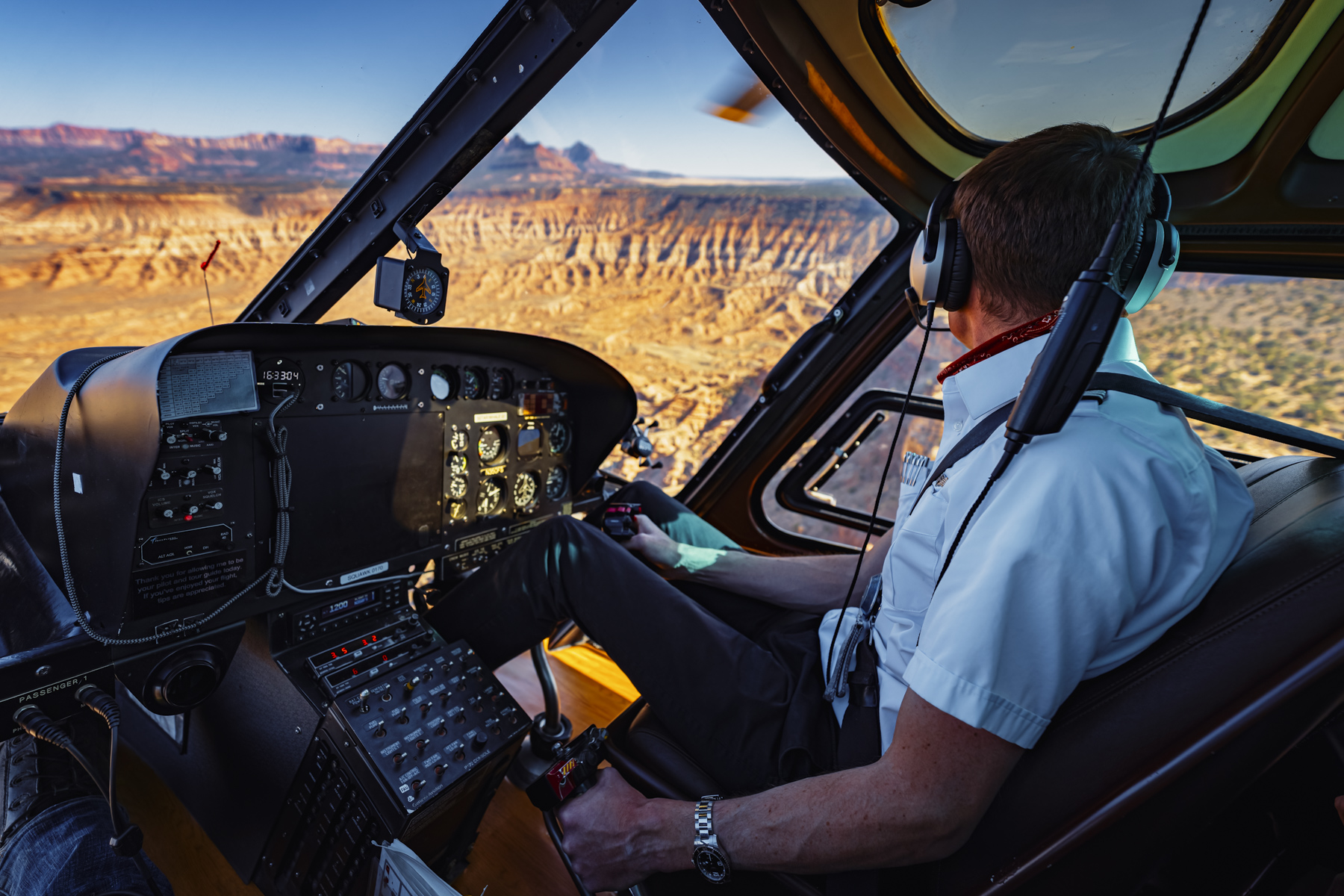
My early approach was basically vibes with a keyboard shortcut. I would dial in a look in Lightroom, then try to “match” it in video by nudging sliders until my eyes got tired. That worked until it did not. The moment I had to mix cameras, shoot different times of day, or deliver a campaign that included stills and motion, my personal taste stopped being enough. I needed a system that could survive more than one lighting scenario.
The shift happened when I started thinking like a marketing photography consultant instead of a guy trying to make a pretty frame. A campaign is a set of promises. If a brand wants to feel premium, clean, and steady, the color needs to be steady too. If a brand wants to feel energetic, the color can move, but it has to move on purpose. Consistency is not sameness. It is coherence.
This is also where art direction matters more than people admit. If you want to know how to art direct a photoshoot that stays on brand, you stop treating color as an editing problem and start treating it as a planning decision. Wardrobe, surfaces, paint colors, props, and location choices all push your palette before you ever touch a curve. Color science photography is the part that makes those choices translate reliably in the final assets.
A color grading workflow that survives photo and video
Here is the cleanest way I can say it. If your starting point is unstable, your ending point will be chaos. So my workflow became obsessed with the start. That meant camera profiles, calibration, and sane exposure decisions that keep skin tones and neutrals from drifting into weird territory. It is not glamorous work, but neither is regrading sixty clips because the white balance wandered.
On the photo side, I stopped collecting presets like baseball cards and started building a small set of intentional looks that sit on top of a consistent base. That base is where the boring wins live, accurate white balance, controlled saturation, and a predictable curve that does not collapse reds or poison greens. Once the base is reliable, creative presets become style choices instead of emergency fixes.
On the video side, the big unlock for me was treating color space like a real thing, not a suggestion. Shooting log is great, until you push it into a timeline with the wrong transform and wonder why everything looks like it has a gray film on it. A consistent transform and a consistent monitoring setup gave me a stable “normal” before I ever touched the creative grade. That stability is what lets a LUT do its job without turning into a gimmick.
The practical crossover is this. I now build my photo look and my video look from the same intent and the same reference targets. If a brand’s neutrals need to stay neutral, that rule applies everywhere. If their reds are part of their identity, that red gets protected. This is where visual content ROI becomes real. Your team can repurpose assets without fighting them, your designer can drop them into layouts without color triage, and your content repurposing strategy stops being “we could, but we do not have time.”
LUT development and creative presets that match across mediums
LUT development sounds mystical until you treat it like a controlled translation. A LUT is not magic. It is a set of instructions that says “take this input and map it to this output.” If your input changes, the LUT breaks. If your input is consistent, the LUT becomes a reliable shortcut. That is why my LUT development process now starts with standardizing input, not chasing a look.
I build looks with reference frames and reference clips, not random highlights from a good day. If the campaign has hero moments, those become the anchor. If it has skin tones that have to stay honest, those become the anchor too. Then I build a look that supports the brand message, not my mood. If I am shooting for a hospitality client, I might want warmth that feels inviting without turning every white wall into butter. If I am shooting for a manufacturing client, I might want clean neutrals and controlled contrast that feels precise. Different looks, same discipline.
Creative presets are the photo side of the same idea. The goal is not to create a preset that looks good on one image. The goal is to create a preset that behaves across a set. So I design them to protect skin, protect neutrals, and keep saturation from spiking in the exact places that make brands look cheap. Then I leave room for small adjustments because real shoots are not controlled lab tests, they are people, weather, and deadlines.
This is also where a commercial photography brief template should include color decisions. Not complicated ones, just clear ones. What is the intended mood. What colors are sacred. What colors are dangerous. What references define “on brand.” When those decisions are documented, the edit becomes execution, not interpretation. That saves time, and it saves relationships, which is a nice bonus if you like repeat clients and sleeping at night.
Color profiles that keep your campaigns consistent
Color profiles are where the whole thing stops being a personal preference and starts being a system. They are the handshake between capture and post. When they are dialed in, your edits are faster, your looks are more consistent, and your deliverables feel like one campaign instead of a collection of content. That is the quiet value of color science photography. It is not flashy, but it makes everything else work better.
If you are a business owner or marketing director, the actionable next step is simple. Decide whether consistency matters for your brand, then treat it like a requirement in your production plan. Ask for color references. Ask how photo and video will match. Ask how the team handles mixed lighting and different cameras. If you are a photographer trying to grow into higher level commercial work, build a repeatable base workflow and let your creativity sit on top of it, not instead of it.
If you want, tell me what you shoot and where your consistency breaks down, photo to video, skin tones, mixed light, product color accuracy, whatever it is. I will tell you where I would start tightening the system. And if you are building a campaign and you want a strategist who can deliver the visuals and the logic behind them, you already know where to find me.